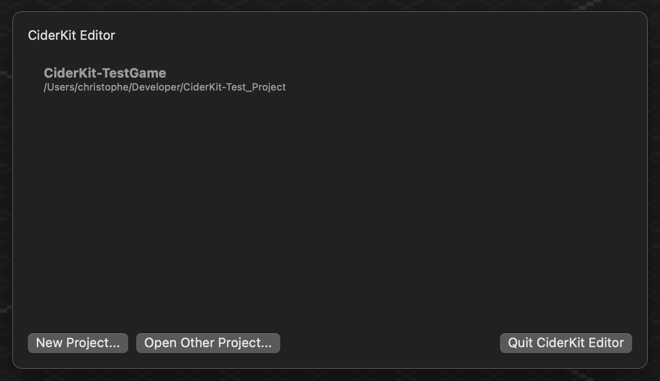
As CiderKit, the authoring tools for The Untitled Project, starts taking shape and becomes more complex, I needed to create windows and UI elements for various purposes. My journey started with the Project Selector. As this is also a learning process, I chose to use SwiftUI and try to understand its inner workings.
 CiderKit’s Project Selector
Except for the unconventional environment and state aspects of SwiftUI, the work on the Project Selector went well and I completed it very pleased with SwiftUI. I even created my own modifier for showing alerts more easily.
But I would soon become disillusioned.
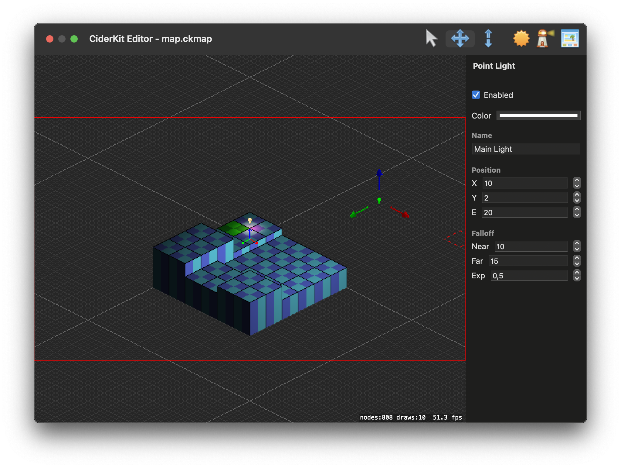
I then embarked on the second leg of this magical SwiftUI trip with implementing real-time inspectors for my map editor. As in any other authoring tool, select an object and its inspectable properties will be displayed in an adhoc user interface element.
I somewhat struggled with Swift protocols at first, and the way the language handles generics. But that’s for an other time.
I also encountered some hickups with the fact that SwiftUI relies heavily on structs implementing the View protocol. But as the View protocol has an associated type, you can only use it as a constraint. However, the some keyword and opaque types came to the rescue and I finally managed to implement a way for my selectable objects to each provide their own specific UI elements.

My initial tests where conclusive. As you can see in the figure above, the map editor lies on the left and the inspector on the right. At first, I tested a single UI element, a checkbox to toggle a light on and off. It was working well and I didn’t notice at the time what would become a huge bottleneck.
Indeed, when I started implementing more complex inspector views, with several text fields with or without steppers, or a color picker, everything became painfully slow. The SpriteKit view renders generally at a flawless 60 frames per second (as long as you’re not using an Intel iGPU). But everytime SwiftUI has to update the inspector view (during movement or even just by typing inside a text field), the render would go down to a very unstable 10~15 fps. It was unacceptable.
I profiled the whole thing and discovered several things. First, the view provided by the selectable object was completely recreated with every redraw. I gained some performance back by caching it, but things remained barely usable. Turns out the SwiftUI inspector view could not be redrawn fast enough. I looked for solutions online and ended up writing a delayed version of ObservableObject that would publish its changes only once every second (see code below).
import Combine
import Foundation

extension ObservableObject {
    func delayed(_ delay: TimeInterval = 1.0) -> DelayedObservableObject<Self> {
        return .init(object: self, delay: delay)
    }
}

@dynamicMemberLookup
class DelayedObservableObject<Object>: ObservableObject where Object: ObservableObject {
    private var original: Object
    private var subscription: AnyCancellable?

    fileprivate init(object: Object, delay: TimeInterval) {
        self.original = object
        subscription = object.objectWillChange
            .throttle(for: RunLoop.SchedulerTimeType.Stride(delay), scheduler: RunLoop.main, latest: true)
            .sink { [weak self] _ in self?.objectWillChange.send() }
    }

    subscript<Subject>(dynamicMember keyPath: WritableKeyPath<Object, Subject>) -> Subject {
        get { original[keyPath: keyPath] }
        set { original[keyPath: keyPath] = newValue }
    }
}
With less frequent redraws, manipulating objects on the map became usable again. Only a few frames were missing per second after that. But values in the inspector were delayed and therefore not accurate during an interaction in the map editor (like while using the Move tool), which was obviously not perfect.
I however considered this use case very specific, maybe not well suited for SwiftUI, and decided to move on.
My first inspectors implemented, I started working on another subject: the Sprite Asset Editor. This tool allows me to compose complex assets with multiple sprites, and eventually animate them. This is displayed as a sheet of the main window, and I wanted once again to use SwiftUI and continue on my learning journey. Nothing is perfect on the first try.
![]() CiderKit’s Sprite Asset Editor
CiderKit’s Sprite Asset Editor
As you can see on the above figure, this is a complex window with a lot of different contexts (the Sprite Asset Database list at the top, the content of a specific Sprite Asset Database on the left, and everything else is basically the editor for the selected Sprite Asset). I would create a view for each context, and using them as a “child” of the other, passing only the data I needed to a specific view.
However, what you see above is in fact done in AppKit, as I never managed to get it working properly with SwiftUI.
You can spot three buttons over a SpriteKit view in the middle (labelled +, 200% and -). Those buttons were only tied to a specific @State managing the scale/zoom of the SpriteKit view, but even without any other data binding involved, clicks on those buttons would produce a huge delay before the interface updated (almost a second). I first thought it was because the main SpriteKit view of the map editor was still rendering in the background. So I disabled rendering if a sheet was displayed, but nothing changed.
I also had issues propagating changes from one context to another. That was the last nail in the coffin for me. At that point, I turned my back onto SwiftUI and switched to AppKit.
I somewhat regret not being able to use SwiftUI in this project. I have the feeling that it is a great technology, but I reckon now that it is probably not suited for my specific use case. However, I still don’t know if I was doing things the wrong way or not. I still plan to use SwiftUI for the updated version of Nihongo no Kana, but as an iOS/iPadOS app with much less frequent redraws, I suppose it won’t be an issue.
Maybe SwiftUI over AppKit is not ready yet. The authoring tools for The Untitled Project are not build as a Catalyst app and do not rely on UIKit. One of the benefits of this refactor however is that there is absolutely no delay whatsoever and everything works perfectly. Sure, it is way more verbose and Auto Layout is not the most pleasing tool to use. But you also get much more control over the behaviour of the app and everything can be meticulously tweaked to your desire.
In the end, even if there is some sense of failure, this is probably the best decision I’ve taken so far on this project.